Were you wondering why there were those weird Star Wars commercials with David Beckham and Snoop Dogg during the World Cup? Turns out they were actually Adidas commercials. Somehow the Adidas branding went right over my head; they probably should have shown actual Adidas products in the commercials. Or maybe they did and I didn't realize it. Anyways, it also turns out that Adidas and Lucasfilm teamed up this year to produce co-branded Star Wars/Adidas footwear and apparel. The Fall 2010 collection was recently unveiled, and there's some pretty cool stuff. I'm especially partial to the C3PO/R2D2 kicks:
The shoes do have split personalities, however, and I'm not sure how great that would look on the street. They might look better as showpieces. But I like the intention. I might have to drop by the Adidas store on Houston St. and see if I can see a pair in person. I might have preferred the R2D2 sneakers just by themselves, but those wires that run between the Adidas stripes on the C3PO sides are pretty snazzy. I also really like how the designers placed the characters' names and images on the shoe tongues. Here's the Chewbacca-inspired boot:
They look rugged, yet cuddly. Just like Chewy.
Monday, August 30, 2010
Tuesday, June 29, 2010
Huf Block Print t-shirt
These shirts are made by skateboard label Huf. A simple design executed perfectly: three blocks in different tones overlaid one on top of the other, allowing the colors to mix accordingly.
Monday, June 28, 2010
Colors In Rhythm Series by 101 Apparel
Yesterday I was browsing around 101 Apparel's website (as my previous post on their "Musica de Sud-America" t-shirt might indicate) and I came across a limited edition series of prints and t-shirts under the label "Colors In Rhythm." These t-shirts have very cool geometric patterns without any text. What I like about these patterns is that they don't feel mathematical to me, like they were formed via some algorithm. Perhaps "geometric" isn't a good way to describe them, although that is how they are described on the website. The patterns are supposedly inspired by mid-century design, but they remind me more of tribal patterns you might find in Sub-Saharan Africa or in Oceania. There are seven t-shirts in the collection, and each come in several colorways (see the whole collection here). They are also made of 100% organic cotton. I'm not sure if 101 Apparel plans to continue Colors In Rhythm (the last collection was from last year), but I hope they do because these t-shirts are fantastic.
Sunday, June 27, 2010
Musica de Sud-America t-shirt from 101 Apparel
Nice t-shirt from 101 Apparel that comes in cream and army green. The t-shirt has a list of all the different musical genres to originate in South America, with the text forming the shape of South America. I'm partial to the cream-colored t-shirt because I'm not a fan of that shade of green, but the reds and yellows of the text on the green t-shirt pop out a lot more from the green background, whereas the color scheme of the cream t-shirt is more muted. I like the concept of the t-shirt and if I came across it in a store I would definitely consider buying it.
Thursday, June 24, 2010
Mbombela Stadium in Nelspruit, South Africa
In my previous post I mentioned how some of the soccer stadiums in South Africa have some great design as far as stadium design goes. Mbombela Stadium is probably my favorite, mostly because of how the seats are painted to form one giant zebra pattern. I don't know why more stadiums don't form patterns with the seats, maybe because designers figure no one would see the patterns since people will be sitting in the seats? Another cool feature of this stadium is the tension rods in the shape of giraffes:
Tuesday, June 22, 2010
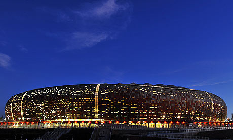
Soccer City Stadium in Johannesburg
What has really caught my eye in the 2010 World Cup, besides the soccer itself, are the awesome-looking stadiums in South Africa. The most prominent of those stadiums is Soccer City in Johannesburg. I'm not sure how to describe it, but I'm sure the phrase "alien spaceship" has been used many times by lots of people.
Anyone who has been watching ESPN's broadcasts of the games has surely noticed Soccer City in the background during halftime and postgame commentary. It's that oval shaped thing with the crazy-looking lights. The effect of the lights makes it seem as if someone poked holes in the exterior of the stadium so that the light inside could peek out. It's brilliant. According to Soccer City's Wikipedia page, the design of the exterior was inspired by the look of an African pot.
Wednesday, May 26, 2010
Maya Romanoff's 2010 catalog
1st Dibs has a nice profile of artist and textiles designer Maya Romanoff, coinciding with the Maya Romanoff company's 40th anniversary. Romanoff might be best known for his incredibly creative wall coverings, which utilize all types of materials and designs, but he has had his hands in the fashion and art world as well. Take for example the awesome Bess' Sunrise installation on the now-demolished Chicago Sun-Times building in 1988. Romanoff draped the building in huge hand-dyed canvases mirroring the patterns made by the reflection of a sunset on the Chicago River:
Romanoff's wall coverings can have a similar monumental feel, even if they are indoors in one's home. See the 2010 catalog here. My favorites from the collection are "Ajiro Marquetry," "Mother of Pearl," "Precious Metals," and "Half Plaid," which looks like a design that could fit easily within a Gustav Klimt painting:
Subscribe to:
Posts (Atom)