Are some wood-grain patterns sexier than others? I don't know, but the patterns on this credenza from Phloem Studio are damn sexy (courtesy 2Modern).
Wednesday, December 14, 2011
Matt Credenza from Phloem Studio
Are some wood-grain patterns sexier than others? I don't know, but the patterns on this credenza from Phloem Studio are damn sexy (courtesy 2Modern).
Friday, November 12, 2010
Hey Sneakerheads
Time Out New York has a nice, little article in this week's issue covering some of the more well-known kicks stores in the city. Check it out here: "Sneakerhead's guide to NYC."
Wednesday, November 10, 2010
sak for Converse Star Tech
So back in March I posted about a collaboration between Converse and Japanese designer Ryusaku Hiruma (a.k.a. sak). sak has put out a new pair of handmade leather shoes based on the All Star template, but this time using the star and slash logo (saw these via Hypebeast). I could personally do without the logo, but what I love about these shoes is the stitched lining around the soles; they give it a real handmade look. I also love the pattern underneath the shoe. Converse is killing it with all their collaborations (see the Missoni collaboration I posted about a few months ago). Hypebeast has a really nice video of Hiruma making the shoes.
Sunday, October 31, 2010
Coffee Bench by Studio Beyond
Saw this via Contemporist: a wooden bench made of a number of different vertical pieces that could be rotated up or down to form table platforms or seats. It was designed by Karolina Tylka for Studio Beyond, and was shown at the Interieur 2010 design bienniale.
Saturday, October 30, 2010
Saw these awesome limited-edition Incase iPad/Macbook/iPhone sleeves via Turntable Lab. They were designed for Incase by the design firm Eley Kishimoto. The sleeves come in black and magenta. Eley Kishimoto has some other products using the same designs. I don't have an iPad (or a Macbook or iPhone for that matter), but I would consider picking one of these up just in case I ever get one.
Wednesday, October 27, 2010
Book cover for Luka and the Fire of Life
This is the cover for the soon to be released Luka and the Fire of Life, by Salman Rushdie. I have to admit I've never read a book by Rushdie, but I might give this one a shot just based on how eye-catching the cover is. An interesting mix of Indian motifs and western style. What a great drawing for a book cover.
Converse All Star Suede
Converse has come out with these really sweet suede sneakers. The rubber base is the same as normal All Stars, but the rest of the shoe is suede and one color, in this case black. Black laces, black toe, even the ankle All Star patch is black. That's what drew me to the pair when I saw it in the store the other day. The one thing that never sat well with me about All Star sneakers was the rubber toe; to me, it makes the sneakers look a bit like clown shoes. Not that that has ever deterred me from buying Converse, but the all suede look is perfect in my book. There's something about black suede on an All Stars design, like a combination of elegance and street style.
Thursday, September 9, 2010
New Missoni/Converse collaboration
These are awesome. The black and white zig-zags looks both funky and elegant, and are a marked improvement (in my mind) to the much more colorful zig-zag patterns of the previous Missoni/Converse collaboration. The leather tongue helps give it a more classy look.
The pattern and materials are in keeping with Missoni's spring/summer 2011 collection, which bears a wide variety of knitted, zig-zag patterned apparel and accessories, much like the fall/winter 2010 collection did. This time, Missoni has also created a Chuck Taylor with a much wider vertical zig-zag that looks like it has been etched into the shoe. Both look great.
Monday, August 30, 2010
Adidas Star Wars Fall 2010 line
Were you wondering why there were those weird Star Wars commercials with David Beckham and Snoop Dogg during the World Cup? Turns out they were actually Adidas commercials. Somehow the Adidas branding went right over my head; they probably should have shown actual Adidas products in the commercials. Or maybe they did and I didn't realize it. Anyways, it also turns out that Adidas and Lucasfilm teamed up this year to produce co-branded Star Wars/Adidas footwear and apparel. The Fall 2010 collection was recently unveiled, and there's some pretty cool stuff. I'm especially partial to the C3PO/R2D2 kicks:
The shoes do have split personalities, however, and I'm not sure how great that would look on the street. They might look better as showpieces. But I like the intention. I might have to drop by the Adidas store on Houston St. and see if I can see a pair in person. I might have preferred the R2D2 sneakers just by themselves, but those wires that run between the Adidas stripes on the C3PO sides are pretty snazzy. I also really like how the designers placed the characters' names and images on the shoe tongues. Here's the Chewbacca-inspired boot:
They look rugged, yet cuddly. Just like Chewy.
The shoes do have split personalities, however, and I'm not sure how great that would look on the street. They might look better as showpieces. But I like the intention. I might have to drop by the Adidas store on Houston St. and see if I can see a pair in person. I might have preferred the R2D2 sneakers just by themselves, but those wires that run between the Adidas stripes on the C3PO sides are pretty snazzy. I also really like how the designers placed the characters' names and images on the shoe tongues. Here's the Chewbacca-inspired boot:
They look rugged, yet cuddly. Just like Chewy.
Tuesday, June 29, 2010
Huf Block Print t-shirt
These shirts are made by skateboard label Huf. A simple design executed perfectly: three blocks in different tones overlaid one on top of the other, allowing the colors to mix accordingly.
Monday, June 28, 2010
Colors In Rhythm Series by 101 Apparel
Yesterday I was browsing around 101 Apparel's website (as my previous post on their "Musica de Sud-America" t-shirt might indicate) and I came across a limited edition series of prints and t-shirts under the label "Colors In Rhythm." These t-shirts have very cool geometric patterns without any text. What I like about these patterns is that they don't feel mathematical to me, like they were formed via some algorithm. Perhaps "geometric" isn't a good way to describe them, although that is how they are described on the website. The patterns are supposedly inspired by mid-century design, but they remind me more of tribal patterns you might find in Sub-Saharan Africa or in Oceania. There are seven t-shirts in the collection, and each come in several colorways (see the whole collection here). They are also made of 100% organic cotton. I'm not sure if 101 Apparel plans to continue Colors In Rhythm (the last collection was from last year), but I hope they do because these t-shirts are fantastic.
Sunday, June 27, 2010
Musica de Sud-America t-shirt from 101 Apparel
Nice t-shirt from 101 Apparel that comes in cream and army green. The t-shirt has a list of all the different musical genres to originate in South America, with the text forming the shape of South America. I'm partial to the cream-colored t-shirt because I'm not a fan of that shade of green, but the reds and yellows of the text on the green t-shirt pop out a lot more from the green background, whereas the color scheme of the cream t-shirt is more muted. I like the concept of the t-shirt and if I came across it in a store I would definitely consider buying it.
Thursday, June 24, 2010
Mbombela Stadium in Nelspruit, South Africa
In my previous post I mentioned how some of the soccer stadiums in South Africa have some great design as far as stadium design goes. Mbombela Stadium is probably my favorite, mostly because of how the seats are painted to form one giant zebra pattern. I don't know why more stadiums don't form patterns with the seats, maybe because designers figure no one would see the patterns since people will be sitting in the seats? Another cool feature of this stadium is the tension rods in the shape of giraffes:
Tuesday, June 22, 2010
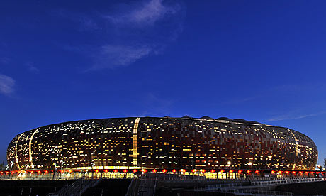
Soccer City Stadium in Johannesburg
What has really caught my eye in the 2010 World Cup, besides the soccer itself, are the awesome-looking stadiums in South Africa. The most prominent of those stadiums is Soccer City in Johannesburg. I'm not sure how to describe it, but I'm sure the phrase "alien spaceship" has been used many times by lots of people.
Anyone who has been watching ESPN's broadcasts of the games has surely noticed Soccer City in the background during halftime and postgame commentary. It's that oval shaped thing with the crazy-looking lights. The effect of the lights makes it seem as if someone poked holes in the exterior of the stadium so that the light inside could peek out. It's brilliant. According to Soccer City's Wikipedia page, the design of the exterior was inspired by the look of an African pot.
Wednesday, May 26, 2010
Maya Romanoff's 2010 catalog
1st Dibs has a nice profile of artist and textiles designer Maya Romanoff, coinciding with the Maya Romanoff company's 40th anniversary. Romanoff might be best known for his incredibly creative wall coverings, which utilize all types of materials and designs, but he has had his hands in the fashion and art world as well. Take for example the awesome Bess' Sunrise installation on the now-demolished Chicago Sun-Times building in 1988. Romanoff draped the building in huge hand-dyed canvases mirroring the patterns made by the reflection of a sunset on the Chicago River:
Romanoff's wall coverings can have a similar monumental feel, even if they are indoors in one's home. See the 2010 catalog here. My favorites from the collection are "Ajiro Marquetry," "Mother of Pearl," "Precious Metals," and "Half Plaid," which looks like a design that could fit easily within a Gustav Klimt painting:
Monday, May 24, 2010
Album cover for Charanjit Singh's "Ten Ragas to a Disco Beat"
This is a great album cover designed by Dutch illustrator Stefan Glerum. I believe the typography is one designed by Glerum himself: ethnic disco monotype.
Thursday, May 13, 2010
Kitsune's spring/summer 2010 collection
French record label/fashion house Kitsune has a few nice pieces in its spring/summer 2010 collection, which they have titled "Kitsune Golf Club." Don't let the name deter you, there really are some nice shirts in the collection:
I like the pale color of the shirt, and that it's a collared shirt with buttons that only go down halfway, but it's not a polo shirt (see my ramblings on polo shirts in this post). Man that dude's hair is distracting...
This western-style shirt is very nice. It might look a tad nicer on someone with broader shoulders, or who wasn't standing in such a schlubby pose, but it's still a very nice shirt.
Again, I like the pale color of the shirt, and the two-tone color adds to the effect. You don't usually see shirts with white collars and cuffs that also have a white pocket, but it's nice in that it breaks up the color of the midsection and adds a little more balance.
You can barely see the patterned shirt but it's quite nice; I especially like the bolder white strip down the middle. It's not something I would wear with a navy or black blazer, but I understand Kitsune is going for the whole preppy vibe so, whatever.
I don't really have any intentions of discussing women's fashion on this site, but I have to point out that the woman's outfit in this picture is awesome. And notice the same western-style shirt on someone who wears it a tad bit better. Come to think of it, Kitsune threw in a lot of western shirts into this collection (see the entire lookbook here), and they're not something that I would normally associate with golf club style. Interesting...
Incidentally, here's a neat interview with Kitsune's founders in 01 Magazine.
I like the pale color of the shirt, and that it's a collared shirt with buttons that only go down halfway, but it's not a polo shirt (see my ramblings on polo shirts in this post). Man that dude's hair is distracting...
This western-style shirt is very nice. It might look a tad nicer on someone with broader shoulders, or who wasn't standing in such a schlubby pose, but it's still a very nice shirt.
Again, I like the pale color of the shirt, and the two-tone color adds to the effect. You don't usually see shirts with white collars and cuffs that also have a white pocket, but it's nice in that it breaks up the color of the midsection and adds a little more balance.
You can barely see the patterned shirt but it's quite nice; I especially like the bolder white strip down the middle. It's not something I would wear with a navy or black blazer, but I understand Kitsune is going for the whole preppy vibe so, whatever.
I don't really have any intentions of discussing women's fashion on this site, but I have to point out that the woman's outfit in this picture is awesome. And notice the same western-style shirt on someone who wears it a tad bit better. Come to think of it, Kitsune threw in a lot of western shirts into this collection (see the entire lookbook here), and they're not something that I would normally associate with golf club style. Interesting...
Incidentally, here's a neat interview with Kitsune's founders in 01 Magazine.
Wednesday, May 12, 2010
Shogun Tavolo lamp by Mario Botta
I saw this lamp today in the Metropolitan Museum of Art's Highlights From the Modern Design Collection galleries. It was designed by Swiss architect Mario Botta in 1986 and manufactured by Artemide. (Botta is probably most well-known in America for designing the San Francisco Museum of Art's building.) The light is diffused through two metal shades and creates some crazy light patterns (check out the images at Stylepark); the outer shade can be adjusted as seen fit. I would love to upgrade the IKEA desk lamp I've had for 10+ years to this...
Tuesday, May 11, 2010
Two nice art gallery websites
The past week was the first annual New York Gallery Week, and while going through the list of participating galleries on the website, it occurred to me that web design should be a pretty important thing for art galleries. You don't want to do the artists you represent a disservice by showing samples of their work on a crappy-looking and difficult to navigate website. Or even a boring website. A stylish and attractive website could make a potential buyer more inclined to actually visit the gallery. And a creative website that shows outside the box thinking can set a tone for the gallery and the kinds of artists it represents. Of course, one might say who cares what the website looks like as long as the artwork looks good. The problem is, the artwork is being shown in the context of the website, and why would you shoot yourself in the foot by pairing good art with bad design?
So here are two art gallery websites that caught my eye:
Participant Inc. What I like about Participant's site is the band that goes across the website and reveals text superimposed on the homepage's photograph as you scroll up and down. I like the concept of hiding and revealing at the same time. It's a little clumsy as is, and the left-justified screen makes the site seem unbalanced, but it's a very interesting concept.
Mitchell-Innes & Nash. The photographs of the gallery space that make up the background to the website are what make Mitchell-Innes & Nash's website stand out. Instead of using white or some other color as the background, they use the background space of the website as an opportunity to showcase the physical space of the gallery, making the viewer feel connected to that space. The site was designed using exhibit-E, a partner company of Dan Miller Design that focuses specifically on web design for art galleries. (Dan Miller Design and exhibit-E have pretty awesome websites too.) Fittingly, exhibit-E has written a book entitled The Art World and the World Wide Web. Obviously, people have been thinking about web design as it relates to art galleries long before I did.
So here are two art gallery websites that caught my eye:
Participant Inc. What I like about Participant's site is the band that goes across the website and reveals text superimposed on the homepage's photograph as you scroll up and down. I like the concept of hiding and revealing at the same time. It's a little clumsy as is, and the left-justified screen makes the site seem unbalanced, but it's a very interesting concept.
Mitchell-Innes & Nash. The photographs of the gallery space that make up the background to the website are what make Mitchell-Innes & Nash's website stand out. Instead of using white or some other color as the background, they use the background space of the website as an opportunity to showcase the physical space of the gallery, making the viewer feel connected to that space. The site was designed using exhibit-E, a partner company of Dan Miller Design that focuses specifically on web design for art galleries. (Dan Miller Design and exhibit-E have pretty awesome websites too.) Fittingly, exhibit-E has written a book entitled The Art World and the World Wide Web. Obviously, people have been thinking about web design as it relates to art galleries long before I did.
Monday, May 10, 2010
5BoroNYCs "Hazy Towers" t-shirt
This t-shirt, made by 5Boro, might be my favorite graphic tee out right now. The "Hazy Towers" image shows the Empire State Building in the foreground, and the former Twin Towers in the background, melding into a faint blue-grey watercolor wash. It's a striking image, a fitting memorial to 9/11. The shirt is a stark contrast to the bold lines and in-your-face designs of most graphic tees made by street wear companies, which ironically makes it stand out all the more. Really, really nice.
Subscribe to:
Posts (Atom)